I’ve had this fantasy exhibition in mind for a little while now: a small gallery packed with ceramic objects on white plinths – so close together that when viewers come to maneuver through the gallery they can’t help but brush up against, and ultimately knock over, the unstable and highly breakable objects. There would be no security to “prevent” people from touching things, and big bags would be more than welcome within the space. The only problem I can see, though (beyond the fact that people would catch on to the “joke” if the exhibition went on for more than a day), would be with health and safety.I'm sure there could be a really elaborate rational about boundaries, expectations and the preciousness of art, but I just thought it was funny.
Showing posts with label Art. Show all posts
Showing posts with label Art. Show all posts
Tuesday, 31 August 2010
Another day sick, Another day browsing.
I came across this exhibition idea I had that I haven't thought about for a while. I shared it in the comments of the (now abandoned) group blog we set up for the MA collaborative project over a year ago now:

Sunday, 29 August 2010


Sunday, 22 August 2010
Hybrid Moments (2010)

Hybrid Moments by Eilis on Mouse Safari
Home videos of cats as paintings, a comparative visual essay.
Wednesday, 5 August 2009

Tuesday, 6 January 2009
Wikipedia Loves Art at the V&A
This February Wikipedia is loving art at the Victoria and Albert museum here in London! A fun opportunity to finally make that contribution to everyone's favorite wiki and take part in a large scale free culture/open media event.
http://en.wikipedia.org/wiki/Wikipedia:WLA@V%26A
http://en.wikipedia.org/wiki/Wikipedia:WLA@V%26A
Sunday, 30 November 2008
Artists with Computers
A really interesting post by Tom Moody looking at the differences between "new media" artists and "artists with computers" in the context of a previous post on "art photography" and "artists with cameras":
[...]I'm wondering, though, if maybe the distinction has a bit to do with how seriously one takes the medium, or whether or not the medium is pushed to the point that it becomes the subject of the work. If this is the case, is the reason why "new media" artists have so much difficulty with "artists with computers" because the artists don't pay enough respect to the technology? Are "artists with computers" just "new media" noobs?
The latter care about their laptops as much as Cindy Sherman cared about her camera. Necessary mechanical skills can be learned but the habits accompanying those skills need to be unlearned. Also, artists may not always and at all times be "with computers"--it's a tool to be picked up and put down as needed.
New media suggests a respect for hardware & software and belief in their newness, something artists with computers don't care about. New media involves a finicky devotion to programming and process, whereas artists with computers are bulls in the Apple Shop. New media artists tend to germinate in design or media arts programs whereas artists with computers incline to studio arts backgrounds or autodidacticism.
[...]
Monday, 17 November 2008
The New AGO = BLING
Images of the new AGO filtered through Blingee. Thank you Lorna Mills & Sally McKay!
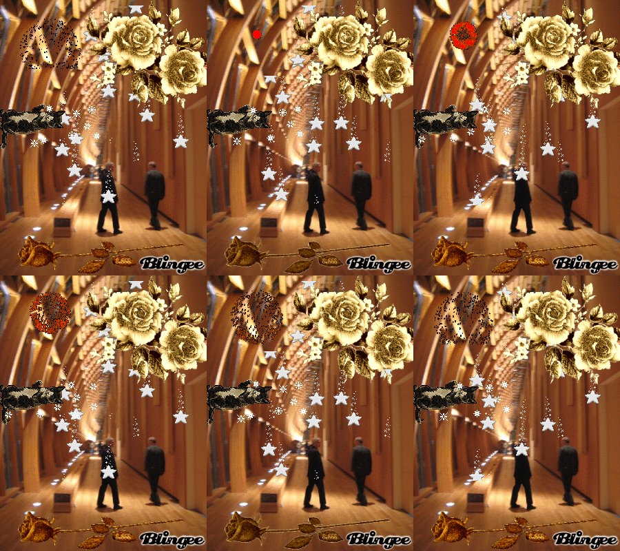
I find the bling helps me really experience the excitement of Frank Gehry's contribution from so far away.
I find the bling helps me really experience the excitement of Frank Gehry's contribution from so far away.
Friday, 10 October 2008
"New Internationalism" and the Information Aesthetic
Throughout the year, my programme offers guest lectures by various artists and academics that deal with contemporary art practice and thought. Yesterday we had our first visiting lecturer, Neil Mulholland. He introduced himself with this Powerpoint presentation he made originally for a panel discussion at the Frieze Art Fair 2005 on New Internationalism which asked:
The context he presented it in for yesterday's talk, however, was not New Internationalism, but for the potential of Art Writing as an alternative to traditional criticism and art historical texts. He argued that Art Writing, as a mise-en-scène, can offer information and criticism without necessarily being mimetic, allowing for greater freedom in the act of writing.
In this context the video (the format we're seeing it in now - as Powerpoint it embodies the tone of the presentation a lot more authentically) is not only an ironic answer to the panel's question, but an exploration of language as well. This typically American style of corporate speak or legalese is used to poke fun at the corporatisation of contemporary art through art fairs and biennales (it also reflects artspeak's own obtuseness) but also looks to it as a new development in language with its own value and merit. It's a linguistic turn with a similar aesthetic value as the images he chose to illustrate his presentation, and one that reminded me a lot of the image bookmarking and surf club scenes.
I guess you could say it's the information aesthetic, but a kind of nostalgic information aesthetic - one that hearkens back to a more innocent time when artificial visual and linguistic representations of utopia had a nice plastic, almost Orwellian, quality, and computers were a pleasant shade of pale taupe.
Does the rapid development of new art centres encourage greater cultural diversity, or has it resulted in a new international orthodoxy? How can discourse keep up with information?This was his response:
The context he presented it in for yesterday's talk, however, was not New Internationalism, but for the potential of Art Writing as an alternative to traditional criticism and art historical texts. He argued that Art Writing, as a mise-en-scène, can offer information and criticism without necessarily being mimetic, allowing for greater freedom in the act of writing.
In this context the video (the format we're seeing it in now - as Powerpoint it embodies the tone of the presentation a lot more authentically) is not only an ironic answer to the panel's question, but an exploration of language as well. This typically American style of corporate speak or legalese is used to poke fun at the corporatisation of contemporary art through art fairs and biennales (it also reflects artspeak's own obtuseness) but also looks to it as a new development in language with its own value and merit. It's a linguistic turn with a similar aesthetic value as the images he chose to illustrate his presentation, and one that reminded me a lot of the image bookmarking and surf club scenes.
I guess you could say it's the information aesthetic, but a kind of nostalgic information aesthetic - one that hearkens back to a more innocent time when artificial visual and linguistic representations of utopia had a nice plastic, almost Orwellian, quality, and computers were a pleasant shade of pale taupe.
Saturday, 27 September 2008
Growing // Innit
Mark Brown, Growing // Innit (2008)
Mark Brown's Gif Dump was recently featured on Rhizome but I really enjoyed this one.
Friday, 26 September 2008
Machines That Almost Fall Over
Michael Kontopoulos, Machines That Almost Fall Over (2008)
A system of sculptures that is constantly on the brink of collapse. My intention was to capture and sustain the exact moment of impending catastrophe and endlessly repeat it.
I like it when something brings about anxiety in myself/the viewer - I can only imagine what it would be like in person.
Via Today and Tomorrow
Thursday, 25 September 2008
Painted Pixels: Richter's 4900 Colours

The Surpentine Gallery is currently exhibiting Gerhard Richter's 4900 Colours: Version II, a large scale project that consists of 196 square panels of 25 colours each that can be combined into a large 4900 colour panel or separately into any desired configuration. The project was kind of a continuation of his stained glass window design for the Cologne Cathedral to replace the window previously destroyed in WWII. The window only consisted of 72 colours that were chosen based on the colour scheme of the original medieval glazes, and then organized randomly using a computer programme in order to create an even distribution of tone.
 For this exhibition, the panels were installed two by two equally spaced along the walls, and despite every painting being unique from the next, their randomness gave each panel a sense of sameness, making it not really worth while to examine each and every one individually. Rather, these paintings worked well from a distance, enveloping you with their pixel-like monotony. In the context of Cathedral Window, the shiny vibrant quality of the enamel bring about what could, I suppose, be deemed a sense of the "technological sublime"* - the colours become a kind of "white noise" (more so with the window - as we've all learned in our art history or colour theory lessons, coloured light points optically blends to become whiter/brighter light - coloured pigment, however, becomes grey/dull) that is very hypnotizing.
What I really appreciated about 4900 Colours, though, was not only how Richter openly relied on computer generation to arrive at his compositions, nor just how their physical treatment gave the coloured squares a stong pixel-like quality, but also how in making them reconfigurable the entire project becomes a big game of cut and paste. Richter has, in my opinion, successfully translated bitmaps and digital image editing into the painted medium. Would it be wrong to include this as another format of net/computer art?
*We've grown accustomed to technology, however, religion still remains suspicious of science and technology with respect to faith, the Bible, etc., so I'd say the "technological sublime" is still apt in this case.
Image sources: 4900 Colours via Serpentine Gallery, Cathedral Window via Wired.
Tuesday, 23 September 2008

Friday, 22 August 2008
As-Found - Collector as Curator
I've mentioned the whole Collector as Curator problem in an earlier post, but without really addressing it properly. Basically all I was doing was pointing to Moody's observation that any collector of online material, in sharing their collection in a curatorial fashion, in essence becomes a Net artist. Now, there are many image collection or "bookmarking" sites out there (such as Ffffound! or VVork) but they often do (if not only) share images by other artists with the hopes of not only sharing interesting images to satisfy the aesthete within us but also to help expand our awareness of up-and-coming or undiscovered individuals. So what about As-Found?


Their mission statement is to collect images that are not created with artistic intentions, but are meant to be viewed with a specific (usually functional) purpose in mind: "If the image has been made by a contemporary artist we don’t want to know about it, because images created with multiple interpretations in mind are useless to us."* In posting the image on their site, they hope to take the image out of its original context and as such give the image new meaning. The image then becomes a kind of work of art; "a found image can match any image produced within the artistic field, in aesthetic, cultural or emotional qualities."*


These are the Readymades of the digital era, and although the blog does manage to take the image out of its original context, and in turn give the image new meaning, we are still made aware of this context through links back to the source, or even worse, by the "don't hotlink" image that often replaces a hotlinked image (although this has even been turned into an "exhibition" on the site). As such the gallery still maintains its position as the great de/re-contextualisor, providing official "art" status to whatever graces its walls (or monitors).
As-Found really is an interesting site to go through though, and I must admit, before reading the introduction, I couldn't always tell if an image was ironic or sincere. So much net.art aims to achieve a similar aesthetic (the "indiscernibles"), but these "non-art" images are just so perfect that they really belong in the (to quote Moody yet again) "'artists might as well retire' category." All that's left is for the collector — as curator — to become creator.
Their mission statement is to collect images that are not created with artistic intentions, but are meant to be viewed with a specific (usually functional) purpose in mind: "If the image has been made by a contemporary artist we don’t want to know about it, because images created with multiple interpretations in mind are useless to us."* In posting the image on their site, they hope to take the image out of its original context and as such give the image new meaning. The image then becomes a kind of work of art; "a found image can match any image produced within the artistic field, in aesthetic, cultural or emotional qualities."*
These are the Readymades of the digital era, and although the blog does manage to take the image out of its original context, and in turn give the image new meaning, we are still made aware of this context through links back to the source, or even worse, by the "don't hotlink" image that often replaces a hotlinked image (although this has even been turned into an "exhibition" on the site). As such the gallery still maintains its position as the great de/re-contextualisor, providing official "art" status to whatever graces its walls (or monitors).
As-Found really is an interesting site to go through though, and I must admit, before reading the introduction, I couldn't always tell if an image was ironic or sincere. So much net.art aims to achieve a similar aesthetic (the "indiscernibles"), but these "non-art" images are just so perfect that they really belong in the (to quote Moody yet again) "'artists might as well retire' category." All that's left is for the collector — as curator — to become creator.
Tuesday, 19 August 2008
I had a dream last night ...
I had a dream last night and Trent Reznor was in it, then I woke up and looked over my regular links and saw this image on Bezembinder's Illustrated Links:

It is by Russian artist/designer Protey Temen who's work looks to explore "different ways of visual environment saturation."

Although I appreciate his illustrations (and especially the above portrait) what really grabs me are his photo/image interventions.


A really great way to understand and know how to work with space is by filling it all up. It forces you to pay attention to the negative spaces that are often ignored, even though they are as important as (if not more than) the main subject matter of an image.
It is by Russian artist/designer Protey Temen who's work looks to explore "different ways of visual environment saturation."

Although I appreciate his illustrations (and especially the above portrait) what really grabs me are his photo/image interventions.
A really great way to understand and know how to work with space is by filling it all up. It forces you to pay attention to the negative spaces that are often ignored, even though they are as important as (if not more than) the main subject matter of an image.
Monday, 18 August 2008


Friday, 15 August 2008

Thursday, 7 August 2008
Mathematical Art
Complex mathematical functions can be some of the most difficult stuff to wrap your head around unless you've got some kind of degree in the subject, but one thing that's great about math is that most functions can be described visually in a two or three dimensional format. What's even greater, though, is that because the functions are so complex and often require a lot of CPU power to generate, the representations are usually quite graphically simple, using bitmaps, basic 3d programs, and often sticking to a basic colour spectrum. I mean, what's important is not the graphic, but the clear expression of a precise function.
Here is a small selection of images and animations that inspired the need to post:
Math Artwork from Paul Nylander's Home Page.


Mathematical Images from Wolfram MathWorld.


Here is a small selection of images and animations that inspired the need to post:
Math Artwork from Paul Nylander's Home Page.

Mathematical Images from Wolfram MathWorld.

Friday, 1 August 2008
Halo Corpse Alphabet; or When Play Becomes Art
A couple days ago, Boing Boing posted a link to the Halo Corpse Alphabet and I was tickled. Halo3screenshots.com came up with an interesting and creative idea and managed to muster up their community to join in and keep their eyes open for corpses that land in the form of a letter or number (even some punctuation!) and screen capture it for the sake of the project. What resulted was, indeed, the Halo Corpse Alphabet font (yes, they edited the images to be used as a font, accessible by all from the bottom of the page).

One of my favorite things, I must admit, is when gaming and art come together. Games have often been looked at as art themselves (for their great graphics, programming, animation, etc.), but what interests me is when it's the user that takes the game to create something with/through it, whether it be a live in-game performance (especially in MMORPGs/MMOs/MPFPSs etc), video, or two-dimensional piece. While dabbling in the World of Warcraft (yes, I played that godforsaken game) I couldn't help but look to various in-game activities as performance or, more specifically, Happenings (such as nude gnome runs). As with other large scale participatory events like these, players document them (as a screen capture or multi-media video) suggesting that something has “happened” and was worth recording for others to see. Like with the Happenings of the 50s and 60s, these are often pointless, with no plot or direction other than what the main action should be. It becomes about the experience: of artist, audience, audience as artist (participant), and artist as audience.
Screen capture also takes on the role of photography (a good example being the above Halo3 screen capture site), so much so that already in 2000 it became the focus of the game Pokemon Snap (N64), where points were collected based on how well your photos came out. Artists have also been using the screen capture aesthetic as medium or inspiration for a few years now, such as Jon Haddock's Isometric Screenshots (also 2000) which illustrate classic moments from film and history using the third person view reminiscent of the Sims or Grand Theft Auto 3. (I'm going to mention here that I'm not even going to bother getting into Second Life, there's at least one thesis that can come from that ball of digital confusion)
Now with blogging and Net Art moving into the realm of online image collection and curation, as Tom Moody puts it (in response to the - first two installments of - online essay/curatorial project IMG MGMT), "We Are All Surf Clubs now." So indeed, "what makes [the net artist] special if everyone can do this?" What happens is that any user with the curiosity and creativity to engage with their games (or the internet in general) in an artistic manner, and then share their experience/product with the world wide web, in essence becomes an artist. It's no longer about the game-as-art, but the game-as-medium applied by a user-as-artist, where the internet (the original art as it's meant to be viewed on your own computer screen!) becomes the art gallery.
Tuesday, 22 July 2008
This is Pop (yeah yeah-ah)!

A couple days ago, Photoshop Disasters posted this image under the title "B&Q: With appologies to Richard Hamilton" with the caption Just What Is It That Makes Today's Sheds So Different, So Appealing? I quite enjoyed the image and the reference and it got me thinking about not only the original Just what is it that makes today’s home so different, so appealing? (1956)
The B&Q image is to illustrate the Lads Shed, a smaller sized shed that is meant to give your child a place to play that simulates the parent's work shed. The great thing about the image is that, in the context of Richard Hamilton's original Pop collage, it takes on new meaning and significance.

Richard Hamilton is among the fathers of British Pop art. He joined a group of artists called the Independent Group and together celebrated American (consumer) culture, looking to create a cultural theory that could reconcile art and popular culture. The belief was that “mass-produced urban culture” could be positive rather than destructive and it was just a matter of analyzing American media as a visual language to become “knowing consumers” (a consumer that can read and understand the imagery of their culture and thus liberate themselves from capitalist manipulation). Just what is it … ? is a poster image of what was necessary to achieve tomorrow, and it is it's artifice as a collage of disparate images that force us to recognize the objecthood of the image itself (as a scene of the ideal future) and the objects themselves (needed to achieve this ideal future).
So what does this mean for the B&Q image, well, first of all, as the product website points out, Lads shed supplied only. That is, the rest of the image which includes the adult male and the large "grown-up" shed are not included (I guess if I put things this way, the kid isn't included either, but whatever), they are only part of the desired outcome of having the Lads Shed installed: to achieve this vision of tomorrow, you need the shed; Buy the kit to make this scene come true, buy the kit so that the child can achieve their desired future (to be like you). Because the image is essentially a collage, it has a very artificial air about it, so we are aware that this isn't reality, or more importantly, that this isn't somebody else's reality. Instead, this is a made up generic reality and is therefore that much more achievable. The objectness of this reality allows the consumer to recognize the image as an icon for a potential individual reality, we are urged to become the "knowing consumer."
I'm probably reading too far into the B&Q image, the graphic artist probably saw an opportunity to do a sweet collage, because the effect, I must say, is pretty sweet. And with all the net-art coming about that goes for this aesthetic, advertising images like this can't be looked at simply as advertisements. So I guess the point of all of this is that social issues and methods of communication go around and come back around. We're still dealing with the same issues, but this time in the digital medium.
* A great article that worth reading if you're interested in consumer culture and art in the Pop era is Toward a Throw-Away Culture. Consumerism, 'Style Obsolescence' and Cultural Theory in the 1950s and 1960s by Nigel Whiteley in the Oxford Art Journal, Vol. 10, No. 2, The 60s (1987). *
Subscribe to:
Posts (Atom)

 Posts


